A
A
P
P
O
O
R
R
T
T
F
F
O
O
L
L
I
I
O
O
I
I
N
N
P
P
R
R
O
O
G
G
R
R
E
E
S
S
S
S
.
.
"I’m not here to just make it pretty; I’m here to make it matter."

Andrei Nastase
Based in London, UK

A design lead, service architect and creative Webflow developer with years of experience, blending creativity and technical expertise to prioritise and elevate business personas. This passion lies in transforming ideas into digital products that create business impact.

Digital/Web Design
Web/Tools Development
Brand Visual Design
Brand Identity Design

Mooving On London is a London-based company specializing in relocation services for both individuals and businesses. They offer comprehensive solutions to ensure smooth transitions within the city and internationally.

  • Industry: Relocation Services
  • Location: London, UK

Mooving On London sought to rejuvenate their brand identity to better reflect their modern approach and to resonate with a broader audience. They approached me with a vision for their rebrand. They wanted a bold and modern logo that symbolized movement and dependability. The key request for the logo was that the word "Mooving" be bold, with the "ON" segment appearing in a normal weight to subtly highlight the company's focus on helping clients move on with ease. Additionally, the brand needed to adopt a refined, two-color palette that would communicate professionalism and trust.

Along with the new logo, the company wanted a complete visual overhaul, including a contemporary color palette and updated typography. The rebranding was intended to attract both individuals and corporate clients, while standing out in the competitive relocation market.

Rebranding Goals:

  • Develop a new logo that embodies movement and reliability.
  • Create a cohesive color palette that conveys trust and professionalism.
  • Select contemporary typography that enhances brand recognition.

To ensure the new brand identity resonated with Mooving On London’s target audience, I conducted thorough market research and competitor analysis. This allowed me to identify opportunities for differentiation, particularly through a unique logo design and strategic color choices.

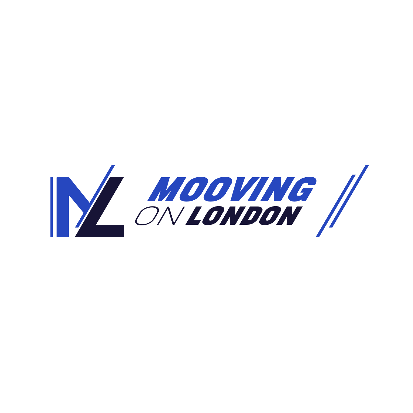
After research and different sketches, I developed a concept that conveyed both movement and brand strength. The design prominently featured the letters "ML" at the forefront, which were stylized, inclined, grounded and could function as a standalone icon or favicon. The full logo reads "ML Mooving On London," with all letters capitalized. Two fonts were carefully chosen for contrast and emphasis: one font for the "Mooving On London" text, and a distinct, more neutral font for "ON" to create subtle emphasis.

The "ML" icon was designed to be versatile, serving as a recognizable standalone logo that could be used across various platforms, while still being part of the larger brand identity. The slight inclination of the entire logo, including the stylized "ML," further reinforced the sense of forward motion and progress, echoing the company's mission to help clients move forward seamlessly.

XADENEMA
Identity

XADENEMA is a sound design start-up with a futuristic approach, focusing on creating cutting-edge sound designs and sample libraries. The brand identity needed to reflect both the technical precision of their work and their forward-thinking ethos, capturing the essence of innovation and creativity in the world of sound..

  • Industry: Sound Design and Sample Creation
  • Location: London, UK

The name and logo needed to be strong, futuristic, and connected to the concept of DNA. The challenge was to craft a brand identity that felt both new and rooted in the idea of sound as something structured and organic, much like DNA itself.

Branding Goals:

  • Capture the futuristic and innovative essence of the brand while maintaining a clean, modern aesthetic.
  • Incorporate the concept of DNA to symbolize the structured yet organic nature of sound design.
  • Select a bold and futuristic color scheme, where deep tones evoke sophistication, balanced with vibrant accents to symbolize creativity and forward-thinking.

‍The creation of the name “XADENEMA” was an intentional process, guided by phonetic principles. The aim was to design a coined name that felt strong and futuristic while subtly evoking the structure and familiarity of DNA. After several rounds of exploration, I landed on a name that balanced sharp and soft sounds.

The hard "XA" at the beginning was chosen for its futuristic tone and to resemble the shape of DNA, making the name sound bold and assertive. To soften the impact, the word finishes with "MA," which gives a natural flow and gentle closure to the name, providing a harmonious balance between its more aggressive start and approachable end. The four syllables—XA-DE-NE-MA—were carefully selected to ensure the name was easy to pronounce and memorable, fitting within the recommended guidelines for an impactful brand name.

Additionally, I used open vowels within the name to invite sharpness in form, creating a contrast with the more fluid, curved nature of DNA. The goal was to craft a name that didn’t just tell a story but became a character.


The logo was designed to embody the futuristic and precise elements suggested by the name itself. Drawing inspiration from the structural beauty of DNA, I worked with geometric shapes to create a logo that felt sleek and modern while also echoing the natural curvature and complexity of a DNA strand.

Using the golden ratio as a foundational element, I built a series of circles that informed the overall shape and balance of the design. These circles helped in defining the "X" at the core of the logo, where the margins formed the sharp lines needed for a strong, visually striking symbol. The "X" is not just the first letter of the brand name; it became the centerpiece of the logo, symbolizing both the intersection of ideas and the cross-disciplinary nature of sound creation.

The design process aimed to ensure that the logo would be easily recognizable and versatile, with a clean and futuristic look that could work across various platforms. The calculated dimensions of both the logo and accompanying text were precisely aligned using the golden ratio, ensuring the entire visual identity maintained a sense of cohesion and structure. The logo's sharp and modern aesthetic contrasts with the more fluid elements of DNA, much like the contrast between XADENEMA's sharp sound designs and the organic nature of audio samples.

The final result is a brand identity that feels dynamic, instantly recognizable, and visually aligned with the company’s mission of innovation in sound design. The combination of a bold name and futuristic logo makes XADENEMA ready to stand out in a highly competitive market.

MOOVING ON
Website

The website for Mooving On London was designed with a strong emphasis on user familiarity and ease of navigation. The design leveraged the brand's cohesive visual language, incorporating the same content, color palette, typography, iconography, and imagery used throughout the rebrand. Given that the target audience prioritized practicality over aesthetics, the website was created to be intuitive and informative, focusing on functionality rather than excessive modernity that might confuse users.

The website’s content strategy centered around two types of content: original (informative) and evergreen, both chosen to help generate organic traffic and enhance SEO performance. User personas were carefully developed to assess user goals, with a particular focus on making it easy for users to obtain quotes. Differentiation was introduced strategically to improve efficiency without compromising usability. Built on Webflow, the website seamlessly balances practicality and an appealing visual design, ensuring it works well in real-world applications while remaining accessible to a broad audience.

DBM EXPRESS
Website

DBM Express, a well-established relocation company based in London, sought to develop a website that not only represented their business but also effectively communicated the services they offer.

  • Industry: Relocation Services
  • Location: London, UK

Their primary request was to create a site that walked visitors through the process of moving, displayed their accreditations, showcased reviews, and included team photos, making their services feel more personal and credible. Additionally, DBM wanted a dedicated FAQ page to address the most common questions they receive from clients.

Project Goals:

  • Create a branded, user-friendly website that effectively showcases the moving process, reviews, accreditations, and team photos, while aligning with DBM’s visual identity.
  • Implement an integrated quote request and email system, automating personalized communications with custom-designed email templates through Google OAuth and AWS.
  • Select a bold and futuristic color scheme, where deep tones evoke sophistication, balanced with vibrant accents to symbolize creativity and forward-thinking.

Website Design and Functionality

The visual design of the website was closely aligned with DBM’s branding, using the signature red and black colors from their vans to maintain consistency across their digital and physical assets. Custom icons were created to visually enhance key sections of the website, such as the moving process and services offered. A key feature of the site was a simple yet effective "Get a Quote" form, which was designed to collect the necessary information while ensuring a smooth user experience. The form submissions were directly integrated with a personalized email system that sent quotes to the client’s email, maintaining a seamless communication process.

Email Integration and Custom Templates

In addition to the website, DBM Express requested five custom-designed email templates for various client interactions, such as welcome emails, service follow-ups, and review requests. These templates were carefully coded following HTML email guidelines, ensuring compatibility across different email clients. To facilitate the automation of these emails, I set up a Google OAuth app to connect the quote request forms to DBM's email provider.

Moreover, the emails were generated on the server I built in Amazon AWS, where the system would automatically construct and send out the appropriate email based on the user’s input in the form. This approach streamlined communication and ensured that all emails sent adhered to DBM’s brand style and messaging.


Digital Contract Signature System

One of DBM’s key requirements was to implement a digital contract signature system. This system allowed users to input their details, sign a digital contract, and receive a signed PDF via email. At the same time, a copy of the signed document was also sent to DBM for record-keeping. I developed this functionality using AWS Lambda functions and API proxies, ensuring the system was both secure and efficient. The solution provided a seamless user experience, allowing clients to finalize agreements digitally without any hassle.

MOOVING ON
Customer Management Page

Mooving On London required a bespoke customer management system to streamline the handling of quote requests and client communication. I developed a comprehensive administrator page that efficiently extracts and organizes all quote requests from both the company’s website and partner websites. This system allows the administrator to view, manage, and interact with leads, offering a fully customized approach to client communication and project management.

  • Industry: Relocation Services
  • Location: London, UK

The primary goal of the system was to provide Mooving On London with an ordered view of all incoming leads and their respective details, making client management a seamless experience. Leads were displayed in a clear list, with each entry containing all the necessary information about the customer and their move.

Project Goals:

  • When a new lead is added, the system allows the administrator to choose a specific email template and customize fields such as headlines, titles, and content. The email is dynamically constructed based on the selected options, ensuring that only relevant information is included in the final email.
  • The administrator page includes an editable HTML preview feature. This allows the administrator to see a real-time preview of the email and make direct edits to elements within the preview, creating a user-friendly, intuitive workflow.
  • The page also allows administrators to add new clients, edit existing client information, and search for specific clients with ease. Labels can be added to categorize clients, and events related to their move can be seamlessly integrated into Google Calendar.
  • The system provides tools to easily calculate and display the distance and directions for each client's move, improving the administrator's understanding of logistical requirements.

Technical Implementation

The system was built using Webflow as the primary host and HTML editor. The backend functionality was supported by an AWS server tailored to the system's needs, providing the power behind dynamic email construction, client management, and security features.

Security was a top priority, given the sensitive nature of client information. A custom login page was created using AWS security capabilities to ensure that only authorized personnel could access the system.


Design and Usability

The design of the CRM administrator page focused on simplicity and effectiveness, allowing employees to navigate the system easily without overwhelming them with complex functionality. The layout was intuitive and organized on a single page, ensuring that all necessary tools were readily accessible. To maintain brand consistency, the company’s colors were integrated into the design, providing a personalized and cohesive experience for Mooving On London’s staff.

L. D.
Marketing Materials Design

L.D. is a nail care and training business based in London, approached me to create a branded marketing package that reflected their unique business identity.

  • Industry: Nail Care and Nail Design Training
  • Location: London, UK

The primary objective of this project was to develop a range of marketing materials and operational files that would serve both online and offline needs. Branded materials had to be versatile enough to translate seamlessly across social media platforms as well as traditional print materials.

My approach was to align the new designs with their existing office interior, ensuring that the materials visually complemented their space and overall brand presence.

Project Goals:

  • Custom graphics and templates designed for use across L.D. Designs' social media channels, ensuring visual consistency and engagement with their online audience.
  • Branded materials extended to physical items such as business cards, brochures, and flyers.
  • Branded book covers for their training materials and custom invoice designs that align with the overall branding.

Designs were carefully developed to harmonize with the colors and interior design of L.D. Designs' office space. The final designs not only fit well within the business’s aesthetic but also reinforced their professional presence in both the digital and physical realms. By creating materials that were consistent across all platforms, I ensured that the company's brand was instantly recognizable to their audience, regardless of the medium.

A
A
P
P
O
O
R
R
T
T
F
F
O
O
L
L
I
I
O
O
I
I
N
N
P
P
R
R
O
O
G
G
R
R
E
E
S
S
S
S
.
.

A design lead, service architect and creative Webflow developer with years of experience, blending creativity and technical expertise to prioritise and elevate business personas. This passion lies in transforming ideas into digital products that create business impact.

Andrei Nastase
Based in London, UK

Mooving On London is a London-based company specializing in relocation services for both individuals and businesses. They offer comprehensive solutions to ensure smooth transitions within the city and internationally.

MOOVING ON
Visual Identity

Close

Mooving On London

  • Industry:Relocation Services
  • Location:London, UK

Mooving On London sought to rejuvenate their brand identity visuals to better reflect their modern approach and to resonate with a broader audience. They approached me with simple yet specific input: they requested a bold logo with two colors and that the word "ON" be in a normal font weight to create a visual distinction.

Along with the new logo, the company wanted a complete visual overhaul, including a contemporary color palette and updated typography. The rebranding was intended to attract both individuals and corporate clients, while standing out in the competitive relocation market.

To ensure the new brand identity resonated with Mooving On London’s target audience, I conducted thorough market research, clients reviews and competitor analysis. This allowed me to identify opportunities for differentiation, particularly through a unique logo design and strategic color choices.

Rebranding Goals:

  • Develop a new logo that embodies movement and reliability.
  • Create a cohesive color palette that conveys trust and professionalism.
  • Select contemporary typography that enhances brand recognition.

After thorough research and multiple sketches, I developed a concept that conveyed both movement and brand strength. The design prominently featured the letters "ML" at the forefront, which were stylized, inclined, and grounded, functioning as a brandmark, standalone icon or favicon, while also being an integral part of the full logo. The complete logo reads "ML Mooving On London," with all letters capitalized. Two fonts were carefully selected to create contrast and emphasis: one font for the "Mooving _ London" text and a distinct, more neutral font for "ON" to subtly highlight the word.

The design aimed to be easy to remember and immediately recognizable, manipulating perception through the integration of meaning and distinctive visual form. The brain acknowledges and remembers shapes first, so the logo starts with the "ML" brandmark, which is part of the larger logo. This design was not only visually compelling but also strategically aligned with how people process visual information.

The concept was crafted based on clients feedback, who described the company as "fast" and "reliable." The boldness of the logo and the specific font choices reflected this, aligning perfectly with the company's request. The slight inclination of the entire logo, including the stylized "ML," further reinforced a sense of forward motion, echoing Mooving On London’s mission to help clients move forward with ease and reliability.

XADENEMA is a sound design start-up, focusing on creating cutting-edge sound designs and sample libraries. The brand identity needed to reflect both the technical precision and forward-thinking ethos, capturing the essence of innovation and creativity in the world of sound.

XADENEMA
Identity

Close

XADENEMA

  • Industry:Sound Design and Sample Creation
  • Location:London, UK

The name and logo needed to be strong, futuristic, and connected to the concept of DNA. The challenge was to craft a brand identity that felt both new and rooted in the idea of sound as something structured and organic, much like DNA itself.

Branding Goals:

  • Capture the futuristic and innovative essence of the brand while maintaining a clean, modern aesthetic.
  • Incorporate the concept of DNA to symbolize the structured yet organic nature of sound design.
  • Select a bold and futuristic color scheme, where deep tones evoke sophistication, balanced with vibrant accents to symbolize creativity and forward-thinking.

‍The creation of the name “XADENEMA” was an intentional process, guided by phonetic principles. The aim was to design a coined name that felt strong and futuristic while subtly evoking the structure and familiarity of DNA. After several rounds of exploration, I landed on a name that balanced sharp and soft sounds.

The hard "XA" at the beginning was chosen for its futuristic tone and to resemble the shape of DNA, making the name sound bold and assertive. To soften the impact, the word finishes with "MA," which gives a natural flow and gentle closure to the name, providing a harmonious balance between its more aggressive start and approachable end. The four syllables—XA-DE-NE-MA—were carefully selected to ensure the name was easy to pronounce and memorable, fitting within the recommended guidelines for an impactful brand name.

Additionally, I used open vowels within the name to invite sharpness in form, creating a contrast with the more fluid, curved nature of DNA. The goal was to craft a name that didn’t just tell a story but became a character.


The logo was designed to embody the futuristic and precise elements suggested by the name itself. Drawing inspiration from the structural beauty of DNA, I worked with geometric shapes to create a logo that felt sleek and modern while also echoing the natural curvature and complexity of a DNA strand.

Using the golden ratio as a foundational element, I built a series of circles that informed the overall shape and balance of the design. These circles helped in defining the "X" at the core of the logo, where the margins formed the sharp lines needed for a strong, visually striking symbol. The "X" is not just the first letter of the brand name; it became the centerpiece of the logo, symbolizing both the intersection of ideas and the cross-disciplinary nature of sound creation.

The design process aimed to ensure that the logo would be easily recognizable and versatile, with a clean and futuristic look that could work across various platforms. The calculated dimensions of both the logo and accompanying text were precisely aligned using the golden ratio, ensuring the entire visual identity maintained a sense of cohesion and structure. The logo's sharp and modern aesthetic contrasts with the more fluid elements of DNA, much like the contrast between XADENEMA's sharp sound designs and the organic nature of audio samples.

The final result is a brand identity that feels dynamic, instantly recognizable, and visually aligned with the company’s mission of innovation in sound design. The combination of a bold name and futuristic logo makes XADENEMA ready to stand out in a highly competitive market.

MOOVING ON
Website

The website for Mooving On London was designed with a strong emphasis on user familiarity and ease of navigation. Given that the target audience prioritized practicality over aesthetics, the website was created to be intuitive and informative, focusing on functionality rather than excessive modernity that might confuse users.

The website’s content strategy centered around two types of content: original (informative) and evergreen, both chosen to help generate organic traffic and enhance SEO performance. User personas were carefully developed to assess user goals, with a particular focus on making it easy for users to obtain quotes.

DBM Express, a well-established relocation company based in London, sought to develop a website that not only represented their business but also effectively communicated the services they offer.

Close

DBM Express

  • Industry:Relocation Services
  • Location:London, UK

Their primary request was to create a site that walked visitors through the process of moving, displayed their accreditations, showcased reviews, and included team photos, making their services feel more personal and credible. Additionally, DBM wanted a dedicated FAQ page to address the most common questions they receive from clients.

Project Goals:

  • Create a branded, user-friendly website that effectively showcases the moving process, reviews, accreditations, and team photos, while aligning with DBM’s visual identity.
  • Implement an integrated quote request and email system, automating personalized communications with custom-designed email templates through Google OAuth and AWS.
  • Select a bold and futuristic color scheme, where deep tones evoke sophistication, balanced with vibrant accents to symbolize creativity and forward-thinking.

Website Design and Functionality

The visual design of the website was closely aligned with DBM’s branding, using the signature red and black colors from their vans to maintain consistency across their digital and physical assets. Custom icons were created to visually enhance key sections of the website, such as the moving process and services offered. A key feature of the site was a simple yet effective "Get a Quote" form, which was designed to collect the necessary information while ensuring a smooth user experience. The form submissions were directly integrated with a personalized email system that sent quotes to the client’s email, maintaining a seamless communication process.

Email Integration and Custom Templates

In addition to the website, DBM Express requested five custom-designed email templates for various client interactions, such as welcome emails, service follow-ups, and review requests. These templates were carefully coded following HTML email guidelines, ensuring compatibility across different email clients. To facilitate the automation of these emails, I set up a Google OAuth app to connect the quote request forms to DBM's email provider.

Moreover, the emails were generated on the server I built in Amazon AWS, where the system would automatically construct and send out the appropriate email based on the user’s input in the form. This approach streamlined communication and ensured that all emails sent adhered to DBM’s brand style and messaging.


Digital Contract Signature System

One of DBM’s key requirements was to implement a digital contract signature system. This system allowed users to input their details, sign a digital contract, and receive a signed PDF via email. At the same time, a copy of the signed document was also sent to DBM for record-keeping. I developed this functionality using AWS Lambda functions and API proxies, ensuring the system was both secure and efficient. The solution provided a seamless user experience, allowing clients to finalize agreements digitally without any hassle.

DBM EXPRESS
Website

Close

Mooving On London

  • Industry:Relocation Services
  • Location:London, UK

The primary goal of the system was to provide Mooving On London with an ordered view of all incoming leads and their respective details, making client management a seamless experience. Leads were displayed in a clear list, with each entry containing all the necessary information about the customer and their move.

Project Goals:

  • When a new lead is added, the system allows the administrator to choose a specific email template and customize fields such as headlines, titles, and content. The email is dynamically constructed based on the selected options, ensuring that only relevant information is included in the final email.
  • The administrator page includes an editable HTML preview feature. This allows the administrator to see a real-time preview of the email and make direct edits to elements within the preview, creating a user-friendly, intuitive workflow.
  • The page also allows administrators to add new clients, edit existing client information, and search for specific clients with ease. Labels can be added to categorize clients, and events related to their move can be seamlessly integrated into Google Calendar.
  • The system provides tools to easily calculate and display the distance and directions for each client's move, improving the administrator's understanding of logistical requirements.

Technical Implementation

The system was built using Webflow as the primary host and HTML editor. The backend functionality was supported by an AWS server tailored to the system's needs, providing the power behind dynamic email construction, client management, and security features.

Security was a top priority, given the sensitive nature of client information. A custom login page was created using AWS security capabilities to ensure that only authorized personnel could access the system.


Design and Usability

The design of the CRM administrator page focused on simplicity and effectiveness, allowing employees to navigate the system easily without overwhelming them with complex functionality. The layout was intuitive and organized on a single page, ensuring that all necessary tools were readily accessible. To maintain brand consistency, the company’s colors were integrated into the design, providing a personalized and cohesive experience for Mooving On London’s staff.

Mooving On London required a bespoke customer management system to streamline the handling of quote requests and client communication. This system allows the administrator to view, manage, and interact with leads, offering a fully customized approach to client communication and project management.

MOOVING ON
Customer Management System

L.D. is a nail care and training business based in London, approached me to create a branded marketing package that reflected their unique business identity.

L.D.
Design

Close

L.D.

  • Industry:Nail Care and Nail Design Training
  • Location:London, UK

The primary objective of this project was to develop a range of marketing materials and operational files that would serve both online and offline needs. Branded materials had to be versatile enough to translate seamlessly across social media platforms as well as traditional print materials.

My approach was to align the new designs with their existing office interior, ensuring that the materials visually complemented their space and overall brand presence.

Project Goals:

  • Custom graphics and templates designed for use across L.D. Designs' social media channels, ensuring visual consistency and engagement with their online audience.
  • Branded materials extended to physical items such as business cards, brochures, and flyers.
  • Branded book covers for their training materials and custom invoice designs that align with the overall branding.

Designs were carefully developed to harmonize with the colors and interior design of L.D. Designs' office space. The final designs not only fit well within the business’s aesthetic but also reinforced their professional presence in both the digital and physical realms. By creating materials that were consistent across all platforms, I ensured that the company's brand was instantly recognizable to their audience, regardless of the medium.